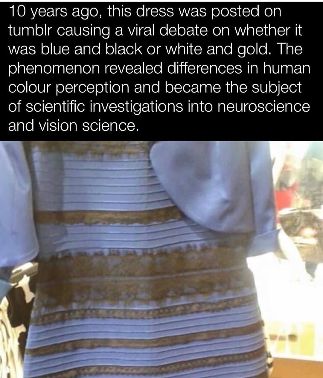
This explains it neatly, the “gold” (which isn’t a color btw) is just brown, and the blue is quite light.
It’s all about contrasts, put a color near a light one and it appears darker, put it near a darker one and it appears lighter.
Bet the bordercolor on different browsers/phones made it look more one way or another.
Also, cold shadows are devoid of yellow so a blue is easily mistaken for a shadow. The impressionist used this trick a lot, light blue/cyan for shadows. Sounds crazy but it works.
Very clever trick.