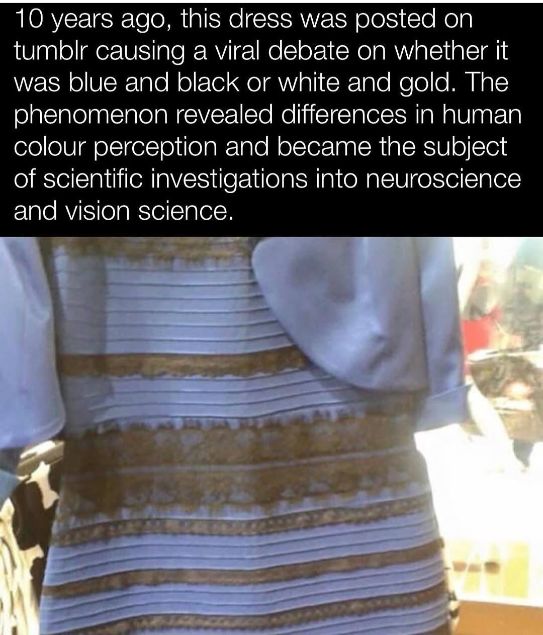
The real dress is actually blue and black, yes, but the illustration tries to show how the exact same colours can look different depending on lighting and context.
In the diagram, the dress on the left is strongly blue and black, while the dress on the right is strongly white and yellow.
And yet the connected parts of the dresses with the “pipes” between them show the exact same colour on one dress can look like a different color on the other. The “pipe” is there so you can follow it with your own eyes from one side to the other and observe that it is indeed the same colour on both sides, despite looking very different when observed as part of the whole image.
The point being, how our brains perceive colour is very situationally dependent, and some people assume a different situation than others, hence the differences in perception.
People tend to believe that vision is absolute, that we all have the same eyes and see the same things, but that’s absolutely not true. The dress phenomenon occurred because It’s not about what your “eyes” see in absolute terms, it’s about what your “brain” does with that information.
if you’re in a room with yellow lighting, then the “black” actually looks black. but if the lighting in the room is blue, then the “black” looks yellow. it’s the different surrounding colors that makes one certain color look like 2 different colors
What finally worked for me on the image above is to look at the yellow dress on the image above on my phone, then zoom in on the part in blue light, then squint so I barely see what I’m doing and move the zoomed in section so that it only shows the party of the black and blue dress in yellow light, and then open my eyes again. Then it finally looked yellow and white.
This explains it neatly, the “gold” (which isn’t a color btw) is just brown, and the blue is quite light.
It’s all about contrasts, put a color near a light one and it appears darker, put it near a darker one and it appears lighter.
Bet the bordercolor on different browsers/phones made it look more one way or another.
Also, cold shadows are devoid of yellow so a blue is easily mistaken for a shadow. The impressionist used this trick a lot, light blue/cyan for shadows. Sounds crazy but it works.

those color illusions always wreck my brain
This literally clears up nothing for me and I’m about to lose it. It’s still fucking blue and black
The real dress is actually blue and black, yes, but the illustration tries to show how the exact same colours can look different depending on lighting and context.
In the diagram, the dress on the left is strongly blue and black, while the dress on the right is strongly white and yellow.
And yet the connected parts of the dresses with the “pipes” between them show the exact same colour on one dress can look like a different color on the other. The “pipe” is there so you can follow it with your own eyes from one side to the other and observe that it is indeed the same colour on both sides, despite looking very different when observed as part of the whole image.
The point being, how our brains perceive colour is very situationally dependent, and some people assume a different situation than others, hence the differences in perception.
People tend to believe that vision is absolute, that we all have the same eyes and see the same things, but that’s absolutely not true. The dress phenomenon occurred because It’s not about what your “eyes” see in absolute terms, it’s about what your “brain” does with that information.
another thing that makes it weird is the black lines for the folds of the fabric are much darker/defined on the “blue” side
if you’re in a room with yellow lighting, then the “black” actually looks black. but if the lighting in the room is blue, then the “black” looks yellow. it’s the different surrounding colors that makes one certain color look like 2 different colors
What finally worked for me on the image above is to look at the yellow dress on the image above on my phone, then zoom in on the part in blue light, then squint so I barely see what I’m doing and move the zoomed in section so that it only shows the party of the black and blue dress in yellow light, and then open my eyes again. Then it finally looked yellow and white.
This explains it neatly, the “gold” (which isn’t a color btw) is just brown, and the blue is quite light.
It’s all about contrasts, put a color near a light one and it appears darker, put it near a darker one and it appears lighter.
Bet the bordercolor on different browsers/phones made it look more one way or another.
Also, cold shadows are devoid of yellow so a blue is easily mistaken for a shadow. The impressionist used this trick a lot, light blue/cyan for shadows. Sounds crazy but it works.
Very clever trick.