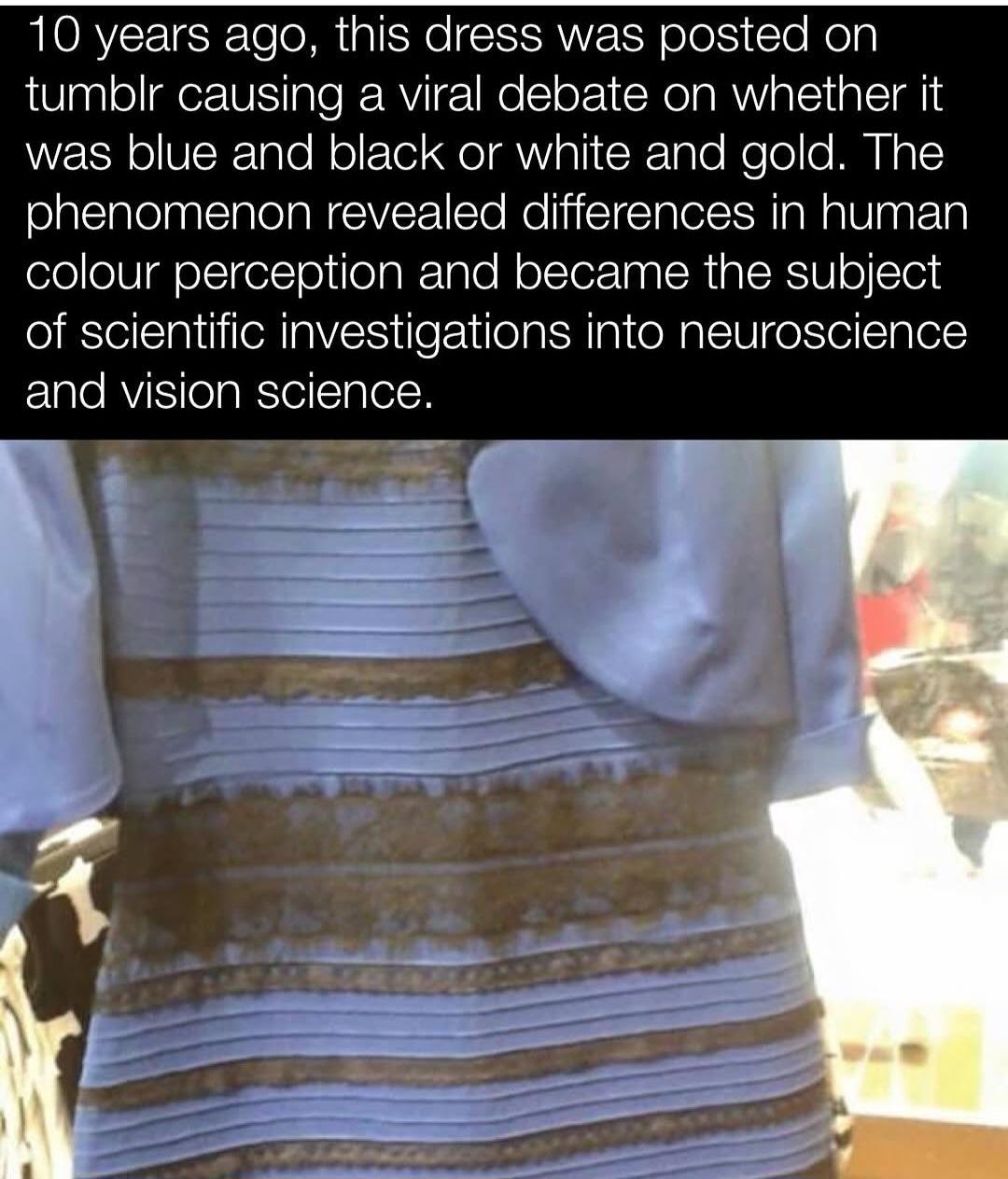
I’ve always really liked this explanation image you can find on Wikipedia page for it. Essentially, people who see white and gold are mistaking the lighting to be cold and blue-tinted, rather than warm and yellow-tinted.
The portions inside the boxes are the exact same colors, you can easily check this with a color picker.
The dress inside the [left] box is still black and blue (with yellow tint). Inside the [right] box the dress is white and gold, with a blue tint.
The black and yellow colors inside the boxes are actually the exact same color, and the same goes for the blue and white colors inside the boxes (which is what the seamless bars connecting them is there to demonstrate). But they look completely different, right? The picture is showing us two different ways the exact same colors can be interpreted differently depending on the context surrounding it.
If you go to my profile and look at my comment before this one, I posted two slightly edited versions of the image that better show how they’re the exact same color.
The way this connects to the original image of the dress, is that some people see a gold and white dress because they think the dress is in blue-tinted lighting, as though they were standing in shade. People who see an overexposed image with a bright yellow tint, on the other hand, will likely see a blue and black dress. I couldn’t tell you why it happens, but it’s the way our brains perceive the lighting that’s doing it.
That would be because the outlines themselves are not the same colors, just the blue/white and black/yellow sections. Here’s an image I quickly edited with the outlines and skin removed, so you can see just how much an effect they have on the image. Both dresses still look normal, but they no longer look like completely different colors when compared together this way.
(edit): And here’s the same image with the outer boxes removed, to show how much the lighting is affecting things, where one of the dresses just looks completely wrong to me now.
As in using the colour picker on the image and finding the corresponding code? That’s actually an explanation that I can get behind. Classic example of trust your instrument.
I see the dress as gold and white, no matter ehow hard I try to see the other side of the coin.
Yup. Really you don’t even need the color picker, as the two horizontal bars seamlessly connecting the two dresses are there to show the same thing.
I think the most fascinating thing about this example image is that I can trick myself into thinking the dress on the left is gold and white. By zooming all the way in so that I can only see the black portion of the dress inside the box and then squinting, it begins to look gold to me. Then scrolling up slowly, the blue portion comes into frame and looks white. It isn’t until I zoom out that the illusion is broken.
I was once able to see the original image as black and blue (though I haven’t managed it today unfortunately), and its baffling how large of a difference it is. You’d think its like some bright sky blue or something, but no, its a deep blue like in the image I sent and our eyes are laughing at us.
Yeah, this is the best explanation for why this ‘controvesy’ happened.
Certain background lighting conditions and colors can significantly alter the color and luminance of certain objects in that lighting environment, which otherwise, in less extreme lighting environments, look different.
Even just understanding basic color theory can show you how to make a color pallette out of either mutually complimentary colors, or highly contrasting colors… and how humans largely, (though apparently to differing extents and by different means), interpret a total color space by comparing and contrasting the colors within that space to each other, as opposed to against some objective reference point of all possible colors.
The other part of this explanation is that…
People were not talking about the same image.
Someone would argue one way, another person argues another way, and then someone else would do some kind of photoshop job to argue for one side, and their explanation and reasoning and justification would get lost, and ok now you have multiple images spreading around and being argued over by the same population that would…
… in 5 years, essentially start a civil war over the idea of whether or not it makes sense to wear a mask during an epidemic of a virus transmitted in the aerosolized spittle from sneezes, coughs, and even just breathing.
But yeah, when this was an ongoing thing, I’d have multiple different people in different camps… sending me actually different images, and it took a while to figure out which one was the actual original origin image.
Which of course I had to do on my own, but critical thinking and basic research skills, an impulse to verify the base assumptions of a claim or argument… many people do not know how to do this, or only selectively do it with things that challenge their pre-existing notions.
Yeah that would never happen a war. Imagine of 3 groups of people worshipped the same God, just prayed to him on the floor, to a wall, and to the ceiling.- I’m sure they would get along and be super harmonious.
How does it look like it’s in a shadow? The rest of the photo is over exposed like in bright lights so it’s safe to assume that the dress is over exposed too.

I’ve always really liked this explanation image you can find on Wikipedia page for it. Essentially, people who see white and gold are mistaking the lighting to be cold and blue-tinted, rather than warm and yellow-tinted.
The portions inside the boxes are the exact same colors, you can easily check this with a color picker.
I don’t understand this, can you explain it?
In the left I see a black and blue dress with a yellow box. The dress inside the box is still black and blue (with yellow tint).
In the right side I see a white and gold dress with a blue. box. Inside the box the dress is white and gold, with a blue tint.
What am i supposed to see here? What is this telling me?
The black and yellow colors inside the boxes are actually the exact same color, and the same goes for the blue and white colors inside the boxes (which is what the seamless bars connecting them is there to demonstrate). But they look completely different, right? The picture is showing us two different ways the exact same colors can be interpreted differently depending on the context surrounding it.
If you go to my profile and look at my comment before this one, I posted two slightly edited versions of the image that better show how they’re the exact same color.
The way this connects to the original image of the dress, is that some people see a gold and white dress because they think the dress is in blue-tinted lighting, as though they were standing in shade. People who see an overexposed image with a bright yellow tint, on the other hand, will likely see a blue and black dress. I couldn’t tell you why it happens, but it’s the way our brains perceive the lighting that’s doing it.
If theyre the same color, why can i see the black outlines way clearer in the yellow dress w/ blue tint side ?
That would be because the outlines themselves are not the same colors, just the blue/white and black/yellow sections. Here’s an image I quickly edited with the outlines and skin removed, so you can see just how much an effect they have on the image. Both dresses still look normal, but they no longer look like completely different colors when compared together this way.
(edit): And here’s the same image with the outer boxes removed, to show how much the lighting is affecting things, where one of the dresses just looks completely wrong to me now.
I never understood this concept until you made the outlines the same. That’s the tip i needed to get over the edge. Thanks!
Ah, so white and gold folks are, indeed, mistaken.
Thanks!
Incorrect. It is impossible to deduce the “real” color from the photo, both sets are true.
The photo is simply bistable.
You can argue that “the real dress bla bla bla”, but nobody’s looking at the real dress and everyone’s looking at the photo.
This has been known for almost as long as the picture has been around. Still doesn’t allow me to see it.
As in using the colour picker on the image and finding the corresponding code? That’s actually an explanation that I can get behind. Classic example of trust your instrument.
I see the dress as gold and white, no matter ehow hard I try to see the other side of the coin.
Yup. Really you don’t even need the color picker, as the two horizontal bars seamlessly connecting the two dresses are there to show the same thing.
I think the most fascinating thing about this example image is that I can trick myself into thinking the dress on the left is gold and white. By zooming all the way in so that I can only see the black portion of the dress inside the box and then squinting, it begins to look gold to me. Then scrolling up slowly, the blue portion comes into frame and looks white. It isn’t until I zoom out that the illusion is broken.
I was once able to see the original image as black and blue (though I haven’t managed it today unfortunately), and its baffling how large of a difference it is. You’d think its like some bright sky blue or something, but no, its a deep blue like in the image I sent and our eyes are laughing at us.
Nope. Color cannot be measured, it is created in the brain. Pickers show pixel values (stimulus) and often don’t correlate to the experienced color.
But you could use one I think, and then have that colour isolated and then dump it somewhere
You cannot measure perception with a color picker. Eyes + brain is not a measurement instrument.
Just like you cannot measure amount of salt used in a dish with your tongue.
I wonder if could be an age component, too? Artificial lighting used to be a lot more yellow. “Party” lighting tends to be more blue.
Yeah, this is the best explanation for why this ‘controvesy’ happened.
Certain background lighting conditions and colors can significantly alter the color and luminance of certain objects in that lighting environment, which otherwise, in less extreme lighting environments, look different.
Even just understanding basic color theory can show you how to make a color pallette out of either mutually complimentary colors, or highly contrasting colors… and how humans largely, (though apparently to differing extents and by different means), interpret a total color space by comparing and contrasting the colors within that space to each other, as opposed to against some objective reference point of all possible colors.
The other part of this explanation is that…
People were not talking about the same image.
Someone would argue one way, another person argues another way, and then someone else would do some kind of photoshop job to argue for one side, and their explanation and reasoning and justification would get lost, and ok now you have multiple images spreading around and being argued over by the same population that would…
… in 5 years, essentially start a civil war over the idea of whether or not it makes sense to wear a mask during an epidemic of a virus transmitted in the aerosolized spittle from sneezes, coughs, and even just breathing.
But yeah, when this was an ongoing thing, I’d have multiple different people in different camps… sending me actually different images, and it took a while to figure out which one was the actual original origin image.
Which of course I had to do on my own, but critical thinking and basic research skills, an impulse to verify the base assumptions of a claim or argument… many people do not know how to do this, or only selectively do it with things that challenge their pre-existing notions.
Yeah that would never happen a war. Imagine of 3 groups of people worshipped the same God, just prayed to him on the floor, to a wall, and to the ceiling.- I’m sure they would get along and be super harmonious.
Very interesting. I wonder how big the effect of culture is on how people perceive this situation
But the dress in the photo looks like it’s in the shadow so it’s a fair assumption that the lighting would be blue-tinted.
How does it look like it’s in a shadow? The rest of the photo is over exposed like in bright lights so it’s safe to assume that the dress is over exposed too.