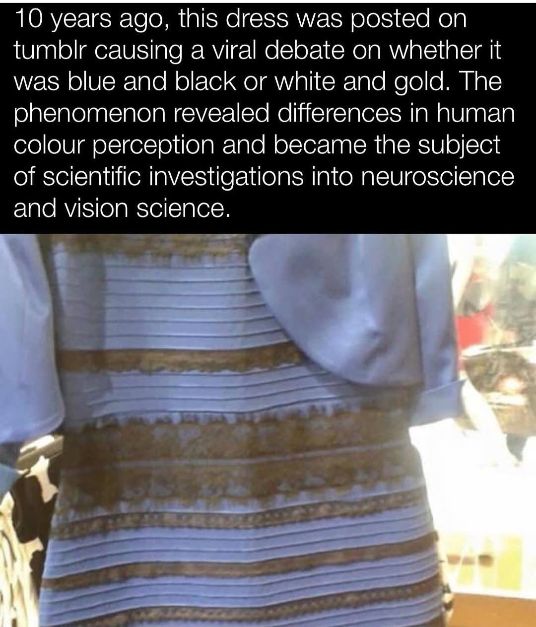
Probably bcos the white and gold people are strictly wrong and it’s incredibly obvious to black and blue people but for some reason there’s a stupid debate because some people are bad at looking at things?
That take only works if you ignore how visual perception actually works. White and gold viewers aren’t wrong—they’re seeing the same pixel values as everyone else, but their brains interpret the lighting differently. The photo has no clear cues about illumination, so the brain fills in the blanks. Some people assume shadow or cool lighting and perceive the colors as lighter, others assume warm light and see them as darker. Both are valid perceptual outcomes given the ambiguity. But here’s the kicker: the actual pixel values in the image are pale blue and a brownish gold. So in terms of what’s literally in the image, white and gold viewers are actually closer to the raw data, regardless of what color the physical dress is in real life. The idea that black and blue people are just “right” misses that distinction completely. What’s especially funny is how often that group doubles down like they’ve uncovered some grand truth, when in reality, they’re just less able—or less willing—to grasp that perception isn’t about facts, it’s about interpretation. It’s like watching someone shout that a painting is wrong because it’s not a photograph.
Ig what you’re failing to understand is that since I, ykno, interpret the lighting correctly? I know I’m right? And everyone that’s wrong is… Bad at looking at things.
If the question were literally referring to the pixel color codes, I wouldn’t argue. But the question refers literally to the physical dress.
Can you explain why people see the lighting differently?
It’s not though, it’s about the picture. We don’t have access to the dress only a digital representation which objectively is a very pale blue and brown, not black and blue.
I gave some of the reasoning as to why this happened in my original comment, but given you’ve doubled down on ‘interpreting the lighting correctly’ and that people are just ‘bad at looking at things’ I guess it’s a bit above your pay grade.
The image has a strong yellowish tone, but there’s no clear source of light, no visible shadows, no specular highlights, and no environmental cues like windows or lamps. The background is a blown-out mess of overexposure, and the lighting direction is totally unclear.
Some people’s brains interpret that yellow cast as warm lighting falling on a blue and black dress. Others interpret it as cool shadow across a white and gold dress. That’s why it’s ambiguous — the image lacks the kind of contextual clues we usually use to judge lighting. What you see as a scene bathed in golden light is your brain choosing one of two plausible explanations and running with it.
If the lighting were actually obvious, this would never have gone viral.
It’s hard for me to agree it’s ambiguous because to me, the lighting is pretty clearly coming from the direction of the camera, since that’s how exposure works.
Yeah, so I’m better at looking at things. My brain chose the right solution. Skill issue for white and gold people, sorry.
The whole reason The Dress became a phenomenon is because there’s just enough visual ambiguity to make multiple interpretations plausible. That doesn’t mean your perception is more accurate — it just means your brain committed quickly to one version and stuck with it. Congrats, but calling it a skill issue only shows a lack of understanding about how perception works. If this were about raw visual ability, neuroscientists wouldn’t still be studying it. You didn’t “solve” anything — you just landed on one of two stable percepts and assumed it was the only correct one. And funnily enough, seeing it as white and gold might actually reflect a system tuned to compensate more for low-light environments, possibly allowing better function in situations where light is limited. So if anything, you might be the one running on default settings.
Nonononono, you are wrong. The question has always been “is this DRESS this color or this color?” NEVER EVER has the question been "Is this PICTURE of the dress this color or this color?
I doubled down on… being correct? I mean. That’s what happened. I interpreted the lighting correctly. So… go ahead and argue against that?
What do you mean you gave your reasoning? You’re talking about how you explained how some people interpreted the lighting incorrectly because they are bad at looking at things?
It is a picture of a dress. It’s not a real dress. It’s a
digital representation. Any question posted alongside it is regarding the digital representation obviously as it is not a real dress in front of us.
You doubled down on lacking the depth to understand what’s actually going on and why you cannot see the true pixels displayed when others can.
Yeah, buddy, sorry. You’re wrong. The debate was solved when the store selling the dress came out and said it was black and blue. You, and maybe some other people who have particularly literal interpretations of things, may have misunderstood the debate entirely from the beginning. It seems that’s the case.
I already established that I wouldn’t argue against pixel values on the picture matching white and gold. I believe you.
People that are arguing that they see black and blue DO SEE THE WHITE AND GOLD that is literally present in the picture DUE TO THE EXPOSURE. They just know it’s obviously black and blue, because they can look at it and interpret it correctly.
Everyone agrees the physical dress is black and blue. That was never the actual debate. The reason this became a global phenomenon is because the photo is so overexposed and lacking in lighting cues that different people genuinely perceive different colors. It’s not about being literal or mistaken — it’s about how the brain interprets visual ambiguity.
Saying black and blue viewers “see” white and gold but just know better doesn’t line up with the research or lived experience of the people who see it differently. Many white and gold viewers don’t consciously override anything — they see pale blue and brownish gold as stable, consistent colors. And those are close to the actual pixel values. So in terms of what’s present in the image, their perception is just as grounded as anyone else’s.
First two sentences in. You’re wrong. When the store owners came out and told everyone the correct colors, the debate ended. Sorry. That’s what happened.
Don’t need to read the rest of your narrative based on a faulty premise.

Probably bcos the white and gold people are strictly wrong and it’s incredibly obvious to black and blue people but for some reason there’s a stupid debate because some people are bad at looking at things?
That take only works if you ignore how visual perception actually works. White and gold viewers aren’t wrong—they’re seeing the same pixel values as everyone else, but their brains interpret the lighting differently. The photo has no clear cues about illumination, so the brain fills in the blanks. Some people assume shadow or cool lighting and perceive the colors as lighter, others assume warm light and see them as darker. Both are valid perceptual outcomes given the ambiguity. But here’s the kicker: the actual pixel values in the image are pale blue and a brownish gold. So in terms of what’s literally in the image, white and gold viewers are actually closer to the raw data, regardless of what color the physical dress is in real life. The idea that black and blue people are just “right” misses that distinction completely. What’s especially funny is how often that group doubles down like they’ve uncovered some grand truth, when in reality, they’re just less able—or less willing—to grasp that perception isn’t about facts, it’s about interpretation. It’s like watching someone shout that a painting is wrong because it’s not a photograph.
Ig what you’re failing to understand is that since I, ykno, interpret the lighting correctly? I know I’m right? And everyone that’s wrong is… Bad at looking at things.
If the question were literally referring to the pixel color codes, I wouldn’t argue. But the question refers literally to the physical dress.
Can you explain why people see the lighting differently?
It’s not though, it’s about the picture. We don’t have access to the dress only a digital representation which objectively is a very pale blue and brown, not black and blue.
I gave some of the reasoning as to why this happened in my original comment, but given you’ve doubled down on ‘interpreting the lighting correctly’ and that people are just ‘bad at looking at things’ I guess it’s a bit above your pay grade.
Sorry, forgot to clarify in my last post:
How, exactly, is the lighting ambiguous? The entire picture is covered in golden light.
The image has a strong yellowish tone, but there’s no clear source of light, no visible shadows, no specular highlights, and no environmental cues like windows or lamps. The background is a blown-out mess of overexposure, and the lighting direction is totally unclear.
Some people’s brains interpret that yellow cast as warm lighting falling on a blue and black dress. Others interpret it as cool shadow across a white and gold dress. That’s why it’s ambiguous — the image lacks the kind of contextual clues we usually use to judge lighting. What you see as a scene bathed in golden light is your brain choosing one of two plausible explanations and running with it.
If the lighting were actually obvious, this would never have gone viral.
It’s hard for me to agree it’s ambiguous because to me, the lighting is pretty clearly coming from the direction of the camera, since that’s how exposure works.
Yeah, so I’m better at looking at things. My brain chose the right solution. Skill issue for white and gold people, sorry.
The whole reason The Dress became a phenomenon is because there’s just enough visual ambiguity to make multiple interpretations plausible. That doesn’t mean your perception is more accurate — it just means your brain committed quickly to one version and stuck with it. Congrats, but calling it a skill issue only shows a lack of understanding about how perception works. If this were about raw visual ability, neuroscientists wouldn’t still be studying it. You didn’t “solve” anything — you just landed on one of two stable percepts and assumed it was the only correct one. And funnily enough, seeing it as white and gold might actually reflect a system tuned to compensate more for low-light environments, possibly allowing better function in situations where light is limited. So if anything, you might be the one running on default settings.
Raw visual ability is funny. You’re a silly guy.
It’s a skill issue, sorry.
Nonononono, you are wrong. The question has always been “is this DRESS this color or this color?” NEVER EVER has the question been "Is this PICTURE of the dress this color or this color?
I doubled down on… being correct? I mean. That’s what happened. I interpreted the lighting correctly. So… go ahead and argue against that?
What do you mean you gave your reasoning? You’re talking about how you explained how some people interpreted the lighting incorrectly because they are bad at looking at things?
It is a picture of a dress. It’s not a real dress. It’s a digital representation. Any question posted alongside it is regarding the digital representation obviously as it is not a real dress in front of us.
You doubled down on lacking the depth to understand what’s actually going on and why you cannot see the true pixels displayed when others can.
Yeah, buddy, sorry. You’re wrong. The debate was solved when the store selling the dress came out and said it was black and blue. You, and maybe some other people who have particularly literal interpretations of things, may have misunderstood the debate entirely from the beginning. It seems that’s the case.
I already established that I wouldn’t argue against pixel values on the picture matching white and gold. I believe you.
People that are arguing that they see black and blue DO SEE THE WHITE AND GOLD that is literally present in the picture DUE TO THE EXPOSURE. They just know it’s obviously black and blue, because they can look at it and interpret it correctly.
Everyone agrees the physical dress is black and blue. That was never the actual debate. The reason this became a global phenomenon is because the photo is so overexposed and lacking in lighting cues that different people genuinely perceive different colors. It’s not about being literal or mistaken — it’s about how the brain interprets visual ambiguity.
Saying black and blue viewers “see” white and gold but just know better doesn’t line up with the research or lived experience of the people who see it differently. Many white and gold viewers don’t consciously override anything — they see pale blue and brownish gold as stable, consistent colors. And those are close to the actual pixel values. So in terms of what’s present in the image, their perception is just as grounded as anyone else’s.
First two sentences in. You’re wrong. When the store owners came out and told everyone the correct colors, the debate ended. Sorry. That’s what happened.
Don’t need to read the rest of your narrative based on a faulty premise.
Skill issue btw.